

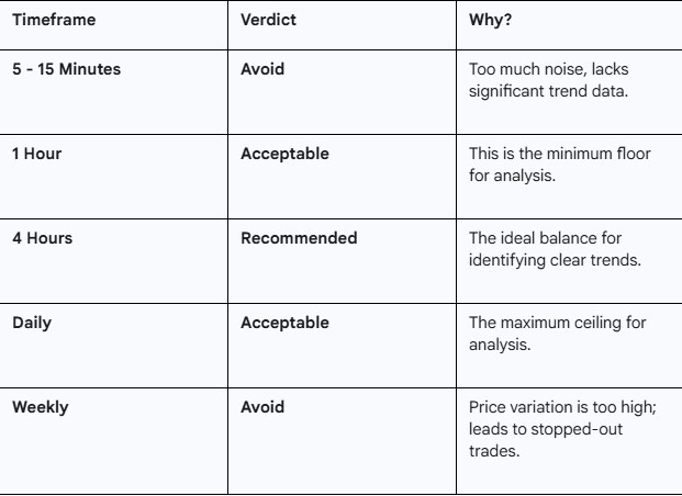
If you have ever looked at a stock chart, seen a fantastic upward trend, entered the trade, and then immediately watched your stop-loss get hit, you are not alone. It is one of the most frustrating experiences in trading. You were right about the direction, but you still lost money.
Why does this happen? According to the insights shared in this video, the culprit is often not your strategy, but the timeframe you are analyzing.
Below, we break down exactly which charts you should be ignoring and which ones offer the “sweet spot” for consistent trading.
The Sweet Spot: 4-Hour to Daily Charts
When setting up your charts, it is crucial to filter out the noise while ensuring you aren’t looking at data that is too zoomed out to be actionable.
In the video, Sowmy VJ identifies a specific range that acts as the Goldilocks zone for traders:
The Preferred Standard: The 4-hour chart is the primary recommendation for analyzing intervals.
The Minimum: On the lower end, the smallest timeframe you should consider is the 1-hour chart.
The Maximum: On the higher end, the maximum timeframe to utilize is the Daily chart.
Key Takeaway: If you are analyzing a trade, ensure your chart is set between the 1-hour and Daily settings, with a strong preference for the 4-hour interval.
The Trap of the Weekly Chart
It is intuitive to think that “zooming out” to a weekly chart gives you a better perspective on the overall health of a stock. While it might show you the long-term history, it is often a trap for active traders.
Sowmy VJ argues there is “no point in looking at the weekly charts” for trade execution. Here is why:
1. The Illusion of Safety
Weekly charts smooth out the data. You might look at a stock and think, “My God, this stock is going fantastic, I need to enter”. It creates a sense of confidence that the trend is unbreakable.
2. The Reality of Volatility
The reality of the market is that hour by hour changes can be drastic. Within a single week candle, the price variation is often massive.
3. The Stop-Loss Killer
Because the price fluctuates so wildly within that week, your tighter stop-losses are highly likely to trigger. You might get stopped out for a loss, even if the stock eventually finishes the week higher.
As Swami notes, “Your stop loss will hit. And then you’ll say, oh, my God, most of my trades are on losses”.
The diagnosis? “That’s because you’re looking at the wrong time frame”.
Avoid the Noise: Micro-Timeframes
Just as looking too far out is dangerous, zooming in too close is equally counterproductive. The video advises that there is no point in looking at the following ultra-short timeframes10:
15-minute charts
5-minute charts
These intervals often present “noise”—random market fluctuations that do not represent a tradable trend for this specific strategy.
Summary: Your Charting Cheatsheet
To keep your trading disciplined, use this quick reference guide based on the discussion:
Final Thoughts
Successful trading isn’t just about picking the right stock; it’s about picking the right battlefield. By sticking to the 1-hour to Daily range, you protect yourself from the drastic volatility of weekly swings and the distracting noise of minute-by-minute updates.
